Entirely Petty Rankings: Best Logo
After reading Zack’s entirely petty rankings from last week, I was struck by the words of the great late 20th-century philosopher Rocky Balboa. Because if I can change, and you can change, everybody can change. So I’m not going to retaliate against Zack’s absurd list of best team names in the Central Division in hopes that we can end this Cold War between basic pettiness and outright disdain. I am going to be the bigger man, I tell you!!
After the solid chirping I received for letting logos influence my rankings of team names, it only makes sense to next rank the best logos in the Central Division, So here is Mason's rankings of the Best logos in the division. I'm turning over a new leaf. The Preds aren’t last this week. They're second to last.
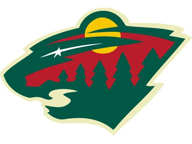
Best: The Minnesota Wild
Yep, numero uno, even though it is so much cooler than the team it represents. For my money (which is none) this is the best logo in the NHL. Look at it! It’s a picture of outside but the picture is inside a bear! There's so much Wild going on! I’m not high enough for this logo! Are there bears in Minnesota though? I mean Brock Lesnar's close and they have a lot of big, burly white people who might qualify as bears... Am I getting my bears mixed up?
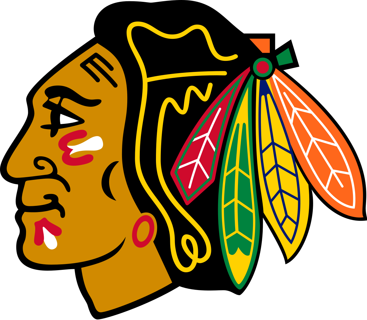
2: Chicago Blackhawks
Annnd this is the second best logo in the NHL. It exudes class and power. That thing uses 9 different colors and somehow doesn’t look like garbage. It's magic. It’s also the least racist native symbol in North American sports… I think? Not that this symbol needed any more padding of the stats, but the mere fact it gives the entire population of Tennessee instant little brother syndrome fills my heart each time I lay eyes on it. Enjoy your Presidents Trophy banner raising, Nashville.
3: St. Louis Blues
It’s a blue blues note representing the bluest hockey town in America. It’s almost
too on the nose. The lines on the note are great though, and every shade of blue the franchise has covered this logo in has looked good. It's a B+ logo, but there's a hell of a curve in this division.
4: Colorado Avalanche
We found out last week that Zack & I at least agree on the fact that Avalanches are pretty freaking sweet. This is a solid logo, but why does it have that little half-circle on the right? Is that a phantom avalanche? It took me 22 years to figure out the oval is on both sides of this logo. It confuses me and has made me feel like a fool! As a Hawks fan, I hate that feeling. Just get rid of the oval! I'm also deducting points since their awesome faux-back Rockies-lanche alternate logo makes this primary mark look worse, by comparison.
5: Winnipeg Jets
Okay, so I know they had at most, maybe 3 months to make this logo when the team split from Atlanta but did no one notice that the maple leaf makes it look like the fighter is blowing up? That seems like an egregious oversight and something pretty fixable in the years after the move. That bogey is down! Poor guys, they never stood a chance against Maverick and Iceman. Or against scoring juggernaut Ryan Reaves apparently.
6: Nashville Predators
Sabretooth cats should be badass but what the hell happened to this guy’s chin?? Zack,
why is your mascot James Ellsworth? That mouth is as wide open as Pekka Rinne's net during a Game 7. It's horrifying, also like a Pekka Rinne Game 7. When my cat pins back his ears like that, it’s because I’ve embarrassed him. So, is that Nashville’s reaction to realizing no one cares about their Presidents Trophy?
Worst: Dallas Stars
Cordell Walker called, he wants his badge back. Man, this is just awful. It actually kinda looks like someone parked the Millennium Falcon on the star. I think the only way to sum up my feelings towards this lazy crime against hockey is through song. The people in Texas will, of course, recognize this classic melody as their state song.
"Cause the eyes of rankings are upon you, Any wrong you do, we're gonna see. When in the Central, look behind you, 'Cause that's where this logo's gonna be.
Wait, the 'Walker, Texas Ranger' Theme isn't your state song? Should be.
